Tag: Video montage

  • Blog: Employing Symmetry (Part 2)

    Blog: Employing Symmetry (Part 2)

    In part 1, we introduced the idea of engaging with symmetry. The reason for this guide? In the same way that we tend to love patterns, symmetry is like Nutella for our eyes. And if you don’t like Nutella, what’s wrong with you? Seriously… Nutella is great. And peanut butter. Yum. Nutella AND and peanut butter. Om nom nom.

    Anyhoo, I digress.

    Why do we like symmetry so much? No one actually knows. There have been studies that reveal that babies will stare longer at symmetrical pictures than they will at asymmetrical ones. And scientific evidence also suggests that as a species we’re more attracted to symmetrical faces. In short, there is something extremely appealing about symmetry, and we’re drawn to it. So, then, we need to have a really, really good reason to intentionally mess with this particular guide.

    As with most of the visual rules we employ – that is the key. Once we understand how and why it works – and just as importantly, we can make it work ourselves – we can then consider messing with it. Take for example Stanley Kubrick, as he is a great case study for a/symmetrical cinematography:

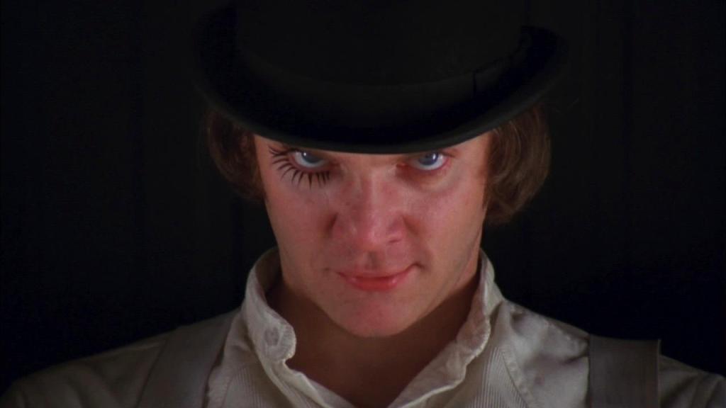
    In cinema what isn’t shown is almost as important as what is. Take the masterful direction of A Clockwork Orange’s opening scene for example.

    Kubrik could have started with a wide shot of the Korova Milk Bar. Instead, he begins with a 16-second straight-on tight shot of Alex’s (the protagonist) face in centre frame. Why? In an instant, he highlights a contrast between symmetry and asymmetry to describe Alex’s madness and deviant behaviour.

    Without uttering a word, the viewer immediately perceives the symmetry. But as the 16-seconds lingers, a visual disquiet makes itself known. In addition to being stared at, there was an alteration to the natural balance: Alex has placed black eyelashes on his right eye only. It is only a tiny detail – and yet it is enough for most viewers to be disturbed by this variation, hinting to them that Alex is not normal. This is then emphasised as the long take begins it’s zoom out.

    Let me say this – and I really can’t stress this enough – there should be no rules when it comes to cinema. Techniques such as symmetrical framing (amongst all the rest) will almost ensure that your image will be aesthetically pleasing. But we do run the risk of creating images that are predictable, common, and quite frankly, boring. Nevertheless – we need to know them, know why they work, know how they work, and know why our piece needs to throw that guide right out the window. Even if it’s by using something as simple as eyelashes.

    Do you have your own thoughts and symmetrical suggestions? Leave a comment below. And if you would like to check out another blog post looking at symmetry, the you can gorge yourself right here.

  • Blog: Employing Symmetry (Part 1)

    If you have ever done research on how to get the right visual shot – whether painted, photographed, or captured in motion – then you probably know the ‘rules.’ This stuff isn’t new. But today I think it’s worth repeating.

    The elephant in the room is that, to misquote the rogue pirate Barbossa, “… the code is more what you’d call “guidelines” than actual rules.” While there is aesthetic appeal with a host of the visual rules that have developed over centuries – the fact is that we can quite easily go ahead and break them. But. Before we do… we really ought to know why the guidelines exist, and why they work first. Then we can decide when and how to best ignore them for our work.

    To demonstrate, take a look at this montage of the cinematographic symmetry (try saying that three times fast!) used in the internationally acclaimed TV series, Sherlock.

    There is something kind of soothing about it, isn’t there? To put it as simply as I can, where the goal of composition is to create a path that is pleasing for the eyes to follow (this is why the guideline exists) – symmetry gives the viewer a vague sense of the harmonious, of beautiful proportions, and of balance (this is why this particular guideline works).

    There are many techniques that will strengthen (or weaken) the symmetric properties of an object or scene. How much of a scene we choose to show is paramount. So too is the position of the camera in relation to the subject, its height, tilt etc. We also need to take particular care to ensure the centre of the composition is equidistant (my word of the day!) to both sides. When done right, it looks simply beautiful. But can you imagine – for example – a shot of the Taj Mahal (an entirely symmetrical structure… right down to its symmetrical reflection in the pools of water around it) that has been misaligned? Well… it would look sort of like this…

    The fact that this image is only slightly out is enough to make it a jarring visual. So while it is possible to break the guidelines of symmetry, if and when we chose to do so, we will really need to go all out. No half measures.

    Coming up in part 2, we will finish looking at how to employ symmetry with another example or two, and some concluding considerations.

  • Montage: What’s Worth Fighting For?

    Most guys – and plenty of the womens too – will agree: what is not to love about a good old fashioned slobber-knocking action flick? There’s action sequences, there’s crap getting blown to smithereens, there’s inspiration pep talks and cheesy one-liners… so much goodness!

    So I was thrilled to find an action film montage made by Rasika Chomkwang this morning. Honestly, the self-titled “hobbyist editor, artist, animator and wannabe film maker,” has made a piece that pretty much hits all the right buttons. You’ll enjoy this one!

  • Blog: Why The Simpsons Continues to Work

    Blog: Why The Simpsons Continues to Work

    Love them or hate them, it cannot be denied that The Simpsons have been an animated mainstay for a little over a generation. But why is it so? It has been written that, “a pictured parody of controversial issues of a society is the most effective approach that target various dilemmas within a society without offending anyone belief, notion, religion, gender and lifestyle.” I consider this to be one of the reasons for longevity of The Simpsons.

    The show has always been paraded as highly dysfunctional. Nevertheless there is an undeniably traditional ‘every’ American family model to the show (father, mother, and the ‘2.4’ children). It is one of the things which has anchored it: we can bank on this dynamic of returning to the comfortable American family scenario by the end of every episode. That trusted formula has allowed the writers to explore some hotly contested social commentaries over its 27-year tenure on TV. Unconsciously knowing that by the end of the 22-minutes everything will be back to normal, we have felt safe exploring these topics with the family.

    Now I admit that this doesn’t sound very video-crafty – so why am I writing about it? Well, I thought it would be an interesting backdrop for what I believe is the second reason that the Simpsons have continued to work: the incorporation of pop culture into the story-lines.

    The pop-culture celebrity list alone is huge, and there are far too many pop culture references to include in a humble blog post (well, one short enough to be read. Honestly, a TLDR comment is the bane of bloggers!). Still, I want to do this point justice.

    As someone who enjoys cinematic elements, I was well pleased to find the following clip. It is my joy to share a cleverly montaged side-by-side comparison of some of the Simpsons cinema references. Created by Spanish student Celia Gómez, I hope you enjoy it just as much as I did!

  • FF: How To Highlight 2016’s Best, In Just Over 1-Minute

    FF: How To Highlight 2016’s Best, In Just Over 1-Minute

    Welcome to the Flick Friday – a series that will motivate you, supercharging your creativity as we delve into cinematography and videography together. Today, we’re sharing a post by a relatively new video channel to both YouTube and Vimeo, called the Art of the Film.

    They have developed a series of videos released today, we are treated to a one-minute (or so) montage that highlights some of the 2016 Oscar nominees. The concept is great, and the execution has been done quite well.

    Do yourself a favour and check out all that they have to offer. For the purposes of Flick Friday, you can whet your appetite by watching the team share their quick look at the five nominees for Best Cinematography at the 88th Academy Awards.

    https://vimeo.com/155886827

  • FF: Quentin Tarantino’s Best Visual Film References… in 3 Minutes!

    FF: Quentin Tarantino’s Best Visual Film References… in 3 Minutes!

    Welcome to the very first Flick Friday post for 2016 – a series that will motivate you, supercharging your creativity as we delve into cinematography and videography together. Today, we’re sharing a great video montage by Jacob T. Swinney on Quentin Tarantino’s Visual References.

    There is lots to be said about this great montage, but we will leave it to Swinney himself to entice you: “It is a well known fact that Quentin Tarantino is a self-proclaimed cinephile. But the writer/director’s love for cinema is most obviously expressed through his own films. In addition to showing his characters spending a great deal of time discussing cinema, Tarantino’s films are jam-packed with homages and visual references to the movies that have intrigued him throughout his life.

    Many filmmakers pay homage, but Tarantino takes things a step further by replicating exact moments from a variety of genres and smashing them together to create his own distinct vision.”

    With over 30 of these visual references to be had, in a word – it is simply brilliant.

    https://vimeo.com/148955244

  • Video Montage: The Turn Smile (Dissolve)

    If you were to ask just about any serious cinematographer for their thoughts on stock footage, the general consensus would be one of derision. In a digital age where content creation is often more important than the complaints of said cinematographers though, using stock footage is a tool you might want to seriously consider. That advice is not without a warning label though.

    Back in April the team at No Film School gave us 6 awesome reasons to consider using stock footage in our work: the cliff notes version is that,

    1. It’s often cheaper and easier than shooting something yourself,
    2. Hollywood uses it,
    3. It’s ready when you need it,
    4. Not all stock footage looks like “stock footage”,
    5. You don’t have to travel everywhere or pay for permits, and
    6. Guess what — stock filmmakers are filmmakers too.

    If you have never heard of Dissolve – it is a stock footage provider, though their branding works quite hard at differentiating itself as a provider of better quality stock than you might get elsewhere. By and large, I like their stuff. With that being said, their own array of stock collages (of which today’s clip is just one example) prove an important point… too much of a good thing really can be terrible! For me, it also highlights this fact: some stock footage really does just look like stock footage – even when you have a better quality stock product!

    Some stock – like the turn smile – just has that look about it. And you know what? That is okay. My point is that if we can stay somewhere between the extremes of outright stock derision and attempting to create a piece using only stock, we might be surprised at how handy – and effective – some well placed stock footage can be.

  • Video Montage: Hello by Movies (Vlot)

    So the world is already sick of hearing Adele’s Hello. That is understandable, considering it has been played to death on pretty much every communication medium known to man.

    Why then would I want to contribute to the agony of humanity? Because I stumbled on an amazing video montage that has recreated the song using nothing but lines from films… and that stuff takes time man! So it is worth the pain of the song to share some love and kudos where it is due.

    Here’s to you Matthijs Vlot!

  • Video Montage: The Breaking Bad Wide Shot (Luengo Ruiz)

    One of the things that I enjoy about film and television is seeing how different directors and DP’s style their work. Even if we have never consciously considered the styling used – once it has been pointed out, we will generally have an “oh yeah!” moment. This phenomena is precisely why I enjoy the following clip by Spanish editor Jorge Luengo Ruiz.

    Inspired by an interview with DP Michael Slovis of AMC’s Breaking Bad fame, Luengo Ruiz highlights a key stylistic shot used throughout the show by montaging them all together into a short 4-minute piece. Care to guess what it is before clicking play?

  • Video Essay: Echoes of Mad Max (WhoIsPablo)

    Australian Director George Miller decided that he did not wish to do a remake or retell the Mad Max story – rather, he wanted to update the universe and the wasteland. He even asked his wife Margaret Sixel to edit the film, even though she had never edited action before. his logic was that, “… if a guy did it, it would look like every other action movie.”

    Even though 2015’s Mad Max: Fury Road is technically an independent movie in the series, it was always a matter of time before someone put in the effort to see whether there were visual echoes between the original Australian New Wave trilogy (1979, 1981, and 1985) and the 2015 release. The good news for fans of the original series is that despite 30-years between drinks, as well as all his intentions to give the world something fresh in Fury Road, a Miller film is a Miller film – and there are echoes in abundance. I hope you enjoy the comparisons as much as I did.