Tag: How to

  • Video Montage: Walk With Me

    ‘Walk with me.’ It always seems like such a nonchalant thing for a character to say – whether that be in a movie or a TV series.

    Well, maybe that isn’t fair. Perhaps my appreciation of the walk and talk as a clever cinematic device simply wasn’t honed enough to pay any serious attention to it. Don’t get me wrong… I LOVE seeing a quality oner thrown into a piece (despite the subject matter, I think the shot from True Detective remains very close to being my favourite oner/long shot).

    Cue a 6-year old montage that I recently stumbled on that shows just how ubiquitous the walk and talk is as a cinematic device. The time spent choreographing these things amazes me… yet there is an important reason that they remain a go-to feature: namely, they give the scene an opportunity to burn through a whole bunch of detailed information, and they can do it in an interesting manner.

    If you really want to drill down into the nuts and bolts of why these shots are used, then let me suggest that you check out this comprehensive article on the topic.

  • Blog: Employing Symmetry (Part 2)

    Blog: Employing Symmetry (Part 2)

    In part 1, we introduced the idea of engaging with symmetry. The reason for this guide? In the same way that we tend to love patterns, symmetry is like Nutella for our eyes. And if you don’t like Nutella, what’s wrong with you? Seriously… Nutella is great. And peanut butter. Yum. Nutella AND and peanut butter. Om nom nom.

    Anyhoo, I digress.

    Why do we like symmetry so much? No one actually knows. There have been studies that reveal that babies will stare longer at symmetrical pictures than they will at asymmetrical ones. And scientific evidence also suggests that as a species we’re more attracted to symmetrical faces. In short, there is something extremely appealing about symmetry, and we’re drawn to it. So, then, we need to have a really, really good reason to intentionally mess with this particular guide.

    As with most of the visual rules we employ – that is the key. Once we understand how and why it works – and just as importantly, we can make it work ourselves – we can then consider messing with it. Take for example Stanley Kubrick, as he is a great case study for a/symmetrical cinematography:

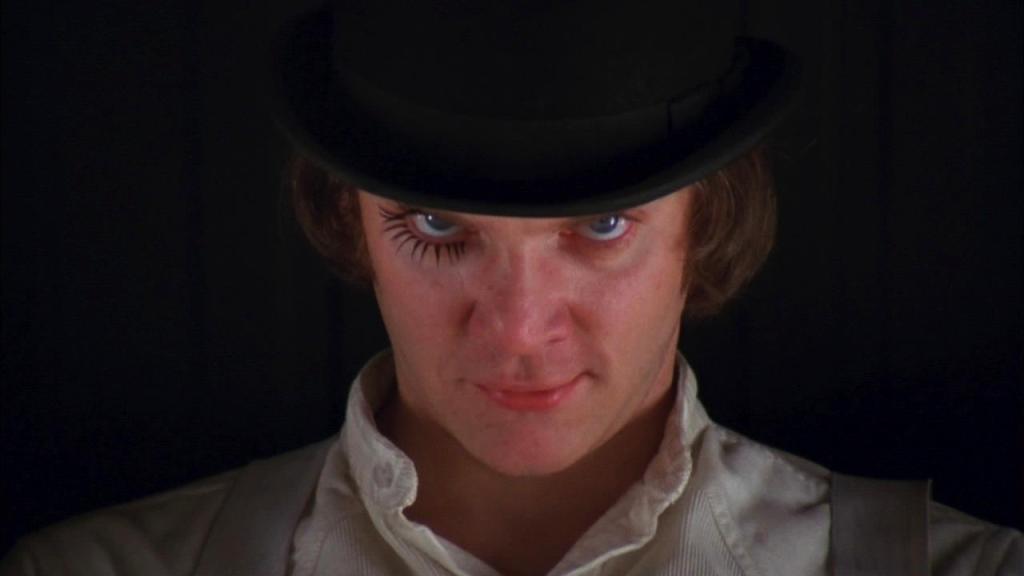
    In cinema what isn’t shown is almost as important as what is. Take the masterful direction of A Clockwork Orange’s opening scene for example.

    Kubrik could have started with a wide shot of the Korova Milk Bar. Instead, he begins with a 16-second straight-on tight shot of Alex’s (the protagonist) face in centre frame. Why? In an instant, he highlights a contrast between symmetry and asymmetry to describe Alex’s madness and deviant behaviour.

    Without uttering a word, the viewer immediately perceives the symmetry. But as the 16-seconds lingers, a visual disquiet makes itself known. In addition to being stared at, there was an alteration to the natural balance: Alex has placed black eyelashes on his right eye only. It is only a tiny detail – and yet it is enough for most viewers to be disturbed by this variation, hinting to them that Alex is not normal. This is then emphasised as the long take begins it’s zoom out.

    Let me say this – and I really can’t stress this enough – there should be no rules when it comes to cinema. Techniques such as symmetrical framing (amongst all the rest) will almost ensure that your image will be aesthetically pleasing. But we do run the risk of creating images that are predictable, common, and quite frankly, boring. Nevertheless – we need to know them, know why they work, know how they work, and know why our piece needs to throw that guide right out the window. Even if it’s by using something as simple as eyelashes.

    Do you have your own thoughts and symmetrical suggestions? Leave a comment below. And if you would like to check out another blog post looking at symmetry, the you can gorge yourself right here.

  • Blog: Employing Symmetry (Part 1)

    If you have ever done research on how to get the right visual shot – whether painted, photographed, or captured in motion – then you probably know the ‘rules.’ This stuff isn’t new. But today I think it’s worth repeating.

    The elephant in the room is that, to misquote the rogue pirate Barbossa, “… the code is more what you’d call “guidelines” than actual rules.” While there is aesthetic appeal with a host of the visual rules that have developed over centuries – the fact is that we can quite easily go ahead and break them. But. Before we do… we really ought to know why the guidelines exist, and why they work first. Then we can decide when and how to best ignore them for our work.

    To demonstrate, take a look at this montage of the cinematographic symmetry (try saying that three times fast!) used in the internationally acclaimed TV series, Sherlock.

    There is something kind of soothing about it, isn’t there? To put it as simply as I can, where the goal of composition is to create a path that is pleasing for the eyes to follow (this is why the guideline exists) – symmetry gives the viewer a vague sense of the harmonious, of beautiful proportions, and of balance (this is why this particular guideline works).

    There are many techniques that will strengthen (or weaken) the symmetric properties of an object or scene. How much of a scene we choose to show is paramount. So too is the position of the camera in relation to the subject, its height, tilt etc. We also need to take particular care to ensure the centre of the composition is equidistant (my word of the day!) to both sides. When done right, it looks simply beautiful. But can you imagine – for example – a shot of the Taj Mahal (an entirely symmetrical structure… right down to its symmetrical reflection in the pools of water around it) that has been misaligned? Well… it would look sort of like this…

    The fact that this image is only slightly out is enough to make it a jarring visual. So while it is possible to break the guidelines of symmetry, if and when we chose to do so, we will really need to go all out. No half measures.

    Coming up in part 2, we will finish looking at how to employ symmetry with another example or two, and some concluding considerations.

  • WW: How to Use Adobe Audition CC to Clean Up Your Audio

    WW: How to Use Adobe Audition CC to Clean Up Your Audio

    Welcome to Whatsit Wednesday – a series that will resource you to do video better, offering hints and tips on how to improve your videocraft.

    One of the things I have found in video production is that if something has gone horribly wrong with the visuals – there will usually be some way of creatively getting around that problem. In the event of poor audio however – the task is significantly harder to achieve. It is definitely better to get clean audio out of the blocks. In the event that you haven’t, there are a couple of things you can try! So today, we’re sharing a short video tutorial that will introduce you to the idea of using software such as Adobe Audition to reduce some unwanted noise from your VO track.

    https://vimeo.com/173096243

  • HIMM: How to Get Smooth Footage

    How It’s Made Monday is meant to inspire you with some of the secrets of videocraft: and today, we’re sharing a great little tip on how to get smooth footage. In short – by yourself a gimbal!

    The 3-axis gimbal market has been exploding all over the place for the last little while: and there have been some pretty cool advances since the first generation of commercially available gimbals hit the market. Little things like going from a 10-bit system to a 32-bit system. And then there is fun bits of kit like this to contend with: the CAME-TV Single!

    https://vimeo.com/146584738

    For under US$1K, you can now get a pretty sweet hand-held motorised 3-axis gimbal… with encoders! In geek speak, encoders are often used in robotics for highly accurate monitoring of motor position. Some of the benefits of using encoders include: preventing motors from losing synchronization and skipping steps, providing important information about frame and camera angles, decreasing power consumption (this is my biggest plus – longer battery life!!), increasing torque, increasing precision of stabilization, and more.

    So check out the review by Tom Antos (which includes some visuals he shot using the Came Single), and be inspired… super smooth professional looking footage is well within reach of the average videographer!

  • HIMM: How To Mess Up Your Aspect Ratio

    HIMM: How To Mess Up Your Aspect Ratio

    How It’s Made Monday is meant to inspire you with some of the secrets of videocraft: sometimes, those secrets lie in how NOT to do things just as much as they are found in how to do things. So today we’re going to share how to mess up your aspect ratio. In short, leave it unplanned!

    For those with amateur experience in videography, let me ask a question: when was the last time you planned the aspect ratio elements of your video production? In all honesty, most people simply point and shoot and hope they capture something that works (and for the record, vertical video should never be considered something that works IMHO). For professionals, as much as depends upon them, the opposite is true. Rather than simply thinking, “I hope this will look good,” they consider what they want the production to look like – and then go about planning the shoot to achieve that end. Believe it or not, this also includes which aspect ratio to use.

    For the most part, I work with widescreen footage (for simplicity, let’s call that 16:9). So when I take a look at a DVD and find the footage has a 4:3 SD ratio, I expect a visual phenomena called pillarboxing. For those who don’t know, that means when the 4:3 image is displayed in a widescreen environment, the image is displayed with added lateral mattes (usually black, though some productions have used more creative ways to add those mattes).

    Subsequently, if you were to fit a widescreen image into a 4:3 environment you could fork out cash to have a pan and scan application made (the important information in each 16:9 scene is shown in the full frame size of the 4:3 aspect ratio this way). Or – the cheaper, and far simpler, alternative would be to letterbox the image. Where pillarboxing is lateral, the letterboxed image has horizontal mattes (usually black bars) above and below it.

    So how can you mess that up?

    severe_windowbox

    While there are many things that might go wrong – my personal favourite would have to be the unintended ratio fail known as windowboxing. In this happy example (above), the source material was 4:3. Some thought went into having footage for a 16:9 audience though, so the advertisement was intentionally pillarboxed to that end. Unknown to the production house (it seems), the channel the advertisement was to air on was actually a 4:3 broadcast. So, the network took this faux 16:9 image and letterboxed it to fit. Given that people have widescreen TV’s though, these lovely people ended up with this glorious mess – a final image that was even further pillarboxed! Such fun!

    So if you want to emulate this lunacy, begin by pointing, shooting, and hoping it all turns out for the best. It’s surprisingly easy to do. Additionally, you should not consider what platform you intend your production to be shown on. Oh, and you should remain completely oblivious to what might happen if your production crosses between display platforms. If you can do these three things – then you will be well on your way to developing ratio blunders of the highest order.
  • WW: How To 3-Point Light An Interview On A Low Budget

    WW: How To 3-Point Light An Interview On A Low Budget

    Welcome to Whatsit Wednesday – a series that will resource you to do video better, offering hints and tips on how to improve your videocraft. Today, we’re sharing a short video tutorial on how you can successfully light an interview when on a low budget.

    When it comes to storytelling from the heart, Stillmotion believe you can learn more from a well-informed friend than you can from the finest academic institutions. To that end, that is how they approach everything they teach–as colleagues. This is also why we are sharing this great tutorial: though originally posted three years ago (and originally titled How to Light An Interview for $26), the presentation is great and the lighting-hack they suggest is still super usable!

  • WW: 3 Ways to Approach Day to Night Timelapse

    WW: 3 Ways to Approach Day to Night Timelapse

    Welcome to the very first Whatsit Wednesday post for 2016 – a series that will resource you to do video better, offering hints and tips on how to improve your videocraft. Today, we’re sharing a 50-minute tutorial on 3 ways that you can go about approaching a day to night timelapse through manipulating aperture priority, blending in post, and ramping up your exposure/ISO.

    Made by Saskatchewan (Canada) local, Preston Kanak – this filmmaker, educator, and time-lapse photographer, unpacks the time-lapse ‘holy grail.’ Demonstrating that while there is an assumption that the day-to-night lapse is complex, the reality is that they may not be as difficult for you to achieve as they appear.

  • HIMM: 4 Things to Help Get A Cinematic Look on a Budget

    HIMM: 4 Things to Help Get A Cinematic Look on a Budget

    One of the most common questions young filmmakers ask is, “How do I make my film look cinematic?” Usually the answer is “good lighting” – but what if you don’t have access to any?

    Though still in school, it is exciting to hear ideas from host and creator of DSLRguide – Simon Cade. Why? Well, when creating content on a tiny budget, you are forced to consider how to make cinematic visuals a little differently: so when a young guy who spends most of his time filming, editing, or learning about filmmaking takes the time to share some of his experiences on how he has gone about achieving that – it’s something worthwhile considering.

    Cade identifies the following four things as items that will help you make up for bad, or at least less than special lighting: locations and sets, colour, emotion, and senses. It’s by no means a comprehensive list – but it will certainly inspire you to move in the right direction.

    “I’m all about learning the meaning behind the choices we make in films, and using film as a method of communication.” – Simon Cade.

  • Blog: 3 Things to Expect from Us This Year

    maxresdefault (2)

    It’s great to back from our January hiatus. The proverbial batteries have been recharged, we’re ready to tackle the 2016 blogosphere – and we’re trying out a new format for our W2BS posts that clearly spells out what you can expect from us throughout the year to come.

    1. Monday’s we will share a How It’s Made Monday post to inspire you with some of the secrets of videocraft.
    2. Wednesday’s will be all about the Whatsit Wednesday posts: a series that will resource you to do video better – offering hints and tips on how to improve your videocraft. And,
    3. Friday’s will further delve into cinematography and videography with Flick Friday posts aimed at motivating you and supercharging your creativity.

    There will also be an array of ad hoc posts that cover all the other fun bits and pieces that the internet tends to offer – as well as the general blog post or two – so the future looks bright for Waiting 2B Scene in 2016.

    It’s wonderful to have you on board!